
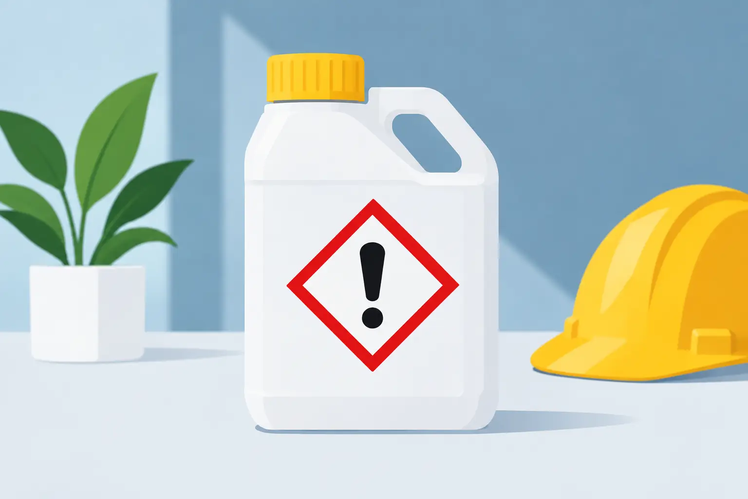
A hazard warning label example is more than a block of required text on a container. It is a working safety tool that must communicate the right risk, action, and identification details at a glance – often in dirty, wet, hot, cold, or high-contact conditions. For manufacturers, the design is only part of the job. The label also has to remain readable and firmly attached through the product’s real-world lifecycle.
What a Hazard Warning Label Needs to Do
A well-produced hazard label helps a user answer three immediate questions: What is this product? What can go wrong? What should I do about it? If any of those answers are unclear, the label may create confusion at the exact moment clear direction matters most.
The specific content depends on the product and the regulatory framework that applies. Chemical products, industrial cleaners, lubricants, batteries, aerosols, and pharmaceutical items can each have different requirements. Many hazardous chemical labels, for example, need elements such as a product identifier, signal word, hazard statements, precautionary statements, pictograms, and supplier information.
A printer can help ensure the label is produced accurately and consistently, but the product manufacturer remains responsible for providing approved copy, symbols, and compliance information. That distinction matters. Printing a sharp label will not correct incomplete or outdated hazard language, but poor printing can make compliant content hard to use.
Hazard Warning Label Example: Industrial Cleaner
Consider a one-quart container of concentrated industrial degreaser. The front or primary display area might identify the product as “Heavy-Duty Citrus Degreaser.” Directly beneath the name, a warning panel could include a signal word such as “WARNING,” the applicable hazard pictogram or pictograms, and a short hazard statement such as “Causes serious eye irritation” or “May cause skin irritation.”
The remainder of the label may carry precautionary instructions, including directions to wear protective gloves and eye protection, wash thoroughly after handling, and keep the container out of reach of children. It may also include first-aid direction, storage instructions, disposal information, net contents, lot coding space, and the manufacturer’s business contact information.
That is a hazard warning label example in functional terms. Its value comes from the order and readability of the information. A customer should not have to rotate a bottle repeatedly or decipher tiny reverse type to find the warning. The safety message needs clear contrast, sensible placement, and enough space to remain legible after the label is applied to the package.
Start With the Product Environment
The best label construction is determined by where the product will go after it leaves the production floor. A warning label on a dry indoor carton has very different demands than one applied to a chemical drum, spray bottle, outdoor equipment part, or refrigerated container.
Moisture, oils, abrasion, ultraviolet exposure, condensation, freezer storage, and repeated handling can all affect label performance. Paper may be appropriate for certain controlled environments and shorter-use applications. Film materials are often a stronger choice where water resistance, flexibility, and durability are needed. A protective laminate or varnish can further reduce scuffing and help preserve print quality.
Adhesive selection is equally important. The adhesive must match the container material and application conditions. A label applied to high-density polyethylene, glass, metal, painted surfaces, or corrugated packaging may require different adhesive behavior. If labels are applied in a cold facility, onto damp containers, or over a curved surface, those conditions should be addressed before production begins.
This is where a production-focused conversation saves time. Rather than selecting material based only on appearance or initial cost, evaluate the full operating environment. A lower-cost label that lifts, smears, or fades can become far more expensive once product rework, customer complaints, or safety concerns are involved.
Make Critical Information Easy to Scan
Hazard labels often contain substantial required copy. The solution is not to reduce font sizes until every line fits. Small type can be technically present but practically ineffective, particularly for warehouse personnel, field technicians, or customers using the product in low-light conditions.
Create a clear hierarchy. The product identifier and signal word should be easy to locate. Hazard pictograms should be reproduced cleanly and at the appropriate size. Warnings and precautionary statements should have enough contrast against the background to read without strain. Important directions should not sit over busy graphics, metallic effects, or color transitions that weaken legibility.
Color can support hierarchy, but it should not be the only way a warning is communicated. A label may be viewed under poor lighting, handled by someone with color-vision differences, or printed in a format where color consistency is limited. Strong typography, white space, borders, and clear content grouping all help the label perform under everyday conditions.
For brands with highly designed packaging, this can require trade-offs. A clean brand presentation matters, but a safety label is not the place to prioritize decorative effects over readable information. Good packaging design gives safety content a deliberate, integrated place instead of treating it as an afterthought.
Specify Print Quality That Supports Compliance
Fine text, symbols, barcodes, variable data, and color-critical elements place real demands on print production. Before approving a run, confirm that the label format accommodates the smallest required text and that any pictograms, borders, and reverse-print elements reproduce clearly on the selected material.
Digital printing can be particularly useful for products with multiple SKUs, frequent artwork revisions, regional variants, or shorter run quantities. It supports efficient changeovers and can help manufacturers avoid holding excess inventory when safety copy, ingredient information, or product details change. For longer, repeatable programs, the best production method depends on volume, material choice, color requirements, and delivery schedule.
Proofing is a critical checkpoint. Review the approved artwork at actual size, not only on a large computer monitor. Check spelling, product identifiers, revision dates, hazard statements, pictogram placement, and supplier information. If the label includes a barcode, test it after printing on the actual substrate. If variable lot or date information will be added later, confirm that the designated area and print process are suitable.
A capable label supplier should also be told about the application equipment. Label dimensions, roll direction, unwind orientation, core size, and spacing between labels affect how efficiently the product runs on an automatic applicator. A label that looks correct in a proof can still cause downtime if its roll specifications do not match the packaging line.
Common Problems to Catch Before Production
The most avoidable errors tend to occur when artwork, materials, and application details are handled as separate decisions. Review the complete label program before placing a production order.
Look for these issues:
- Safety copy that is too small for the available label area or obscured by container curves.
- A paper stock selected for a product exposed to water, chemicals, or refrigeration.
- Adhesive that was not tested on the actual bottle, drum, pouch, or carton surface.
- Inadequate contrast between warning text and the graphic background.
- Outdated hazard language, supplier information, or product formulations carried over from a previous label version.
- Roll specifications that do not match the label applicator or packing operation.
These are not merely artwork details. They affect production efficiency, product presentation, and the ability of users to act safely. A short preproduction review can prevent a costly relabeling project later.
Bring the Right Details to Your Label Quote
A productive quote request starts with more than the finished artwork file. Include the label size, expected order quantities, container material, application method, and the conditions the label will face in use. State whether the product will be refrigerated, stored outdoors, exposed to oils, handled frequently, or cleaned with chemicals.
It also helps to identify whether the label requires variable data, consecutive numbering, barcodes, metallic finishes, tamper-evident features, or special regulatory content. When the project involves multiple product versions, provide all versions early so color, material, and layout can be planned consistently across the line.
Miles Label Company works with manufacturers that need labels to perform beyond the first impression. From industrial products to regulated packaged goods, the right material, adhesive, print process, and roll format can be planned around the realities of your operation.
A hazard label earns trust when it stays attached, stays readable, and gives people the information they need without hesitation. Build those requirements into the label specification before production, and the finished package will be better prepared for the conditions ahead.