
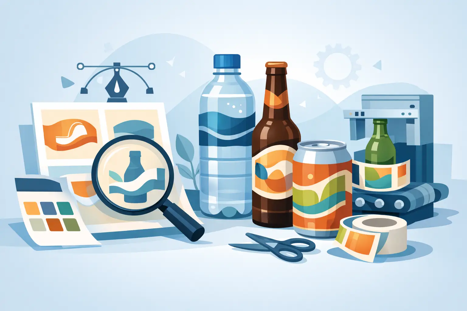
A beverage label has to do more than look good under retail lighting. It may need to stay adhered through refrigeration, condensation, ice buckets, transit, handling, and repeated consumer use. This guide to custom beverage labels focuses on the production decisions that help beverage brands protect shelf appeal, meet required labeling standards, and avoid preventable issues on the packaging line.
For a new product launch or an established SKU refresh, label planning should begin with the container and the environment it will face. Artwork matters, but material selection, adhesive performance, finishing, and print specifications determine whether that artwork reaches the shelf looking as intended.
Start With the Beverage Container and Fill Conditions
The bottle, can, jar, pouch, or other package format establishes the practical limits of the label. A straight-sided glass bottle provides a very different labeling surface than a tapered PET bottle, a slim aluminum can, or a flexible drink pouch. Container diameter, panel shape, curves, seams, and application speed all affect label construction.
Fill conditions are equally important. A label applied to a dry bottle at room temperature may not need the same adhesive as one applied to a cold, damp container. Products stored in coolers or exposed to condensation need materials and adhesives designed to hold through moisture and temperature changes. A label that performs well in a dry sample review can fail quickly once it enters real production and distribution conditions.
Share the following details early in the quoting process: container material and dimensions, label application method, fill temperature, storage conditions, expected moisture exposure, and whether the product will be returned to a cooler after opening. These details allow a label supplier to recommend a construction based on actual use rather than appearance alone.
Choose the Right Label Material
Paper labels remain a strong choice for many beverages, particularly when a textured or traditional presentation supports the brand. They can deliver an elevated look for wine, spirits, specialty sodas, and other products where a tactile label experience is part of the package design. However, standard paper is not the best fit for every cold or wet environment.
Film labels are often preferred for water bottles, refrigerated drinks, sports beverages, ready-to-drink products, and other packages that encounter moisture. Polypropylene and similar film materials offer greater resistance to water, scuffing, and tearing than many paper options. They can also provide a clean, modern appearance and work well with clear-label designs when a no-label look is desired.
The right choice depends on the product’s environment and positioning. A premium wine brand may prioritize texture and specialty embellishments, while a bottled water producer may need consistent performance at higher volumes in refrigerated settings. There is no universal “best” material. The best material is the one that supports the product, application process, and brand objective at the same time.
Adhesive Is Part of the Label, Not an Afterthought
Adhesive selection deserves the same attention as the face material. Permanent adhesives are common for beverage applications, but the formula should match the surface and application conditions. Glass, PET, HDPE, aluminum, and coated containers can require different adhesive performance characteristics.
Cold-temperature adhesive can be necessary when labels are applied in chilled conditions or must remain secure after refrigeration. For products that may be exposed to water or ice, moisture resistance should be verified through practical testing. Label application equipment also matters. A construction that works on one line may not run as efficiently on another without adjustment.
Plan Artwork for the Real Package
Beverage labels work at small scale, often on curved surfaces, and usually alongside competing products. Design files should be built with those conditions in mind. Fine type, hairline rules, subtle tonal shifts, and low-contrast text may look polished on a screen but lose clarity after printing and application.
Prioritize readable product names, flavor identifiers, net contents, and required information. If a label wraps around a container, identify the primary display panel first, then position supporting copy where it remains accessible without crowding the front. On tapered containers, artwork may need distortion compensation so lines and elements appear visually straight after application.
Digital printing provides flexibility for versioned designs, short runs, seasonal releases, and multiple flavors. The HP Indigo 6900 Digital Press used by Miles Label Company supports high-quality color reproduction while allowing brands to manage variations without committing to large inventories of every version. That can be especially useful for beverage programs with regional labels, limited releases, or frequent artwork updates.
Before production, supply press-ready artwork whenever possible and confirm the printer’s file requirements. Review the proof carefully for text, barcode placement, color expectations, dieline alignment, and variable information. A proof is the best time to catch a missing ingredient statement or an incorrect UPC, not after labels arrive at the plant.
Build Compliance Into the Label Layout
Beverage labeling requirements vary by product category, ingredients, alcohol content, state distribution, and sales channel. Water, juice, soft drinks, energy drinks, alcoholic beverages, and functional beverages can all have different requirements. Brands should confirm the rules that apply to their specific product with the appropriate regulatory and legal resources.
From a production standpoint, the label needs enough usable space for required information. That can include the product identity, net quantity, ingredient statement, nutrition information, manufacturer or distributor details, allergen declarations, lot coding space, and barcode. Alcoholic beverage labels may have additional approval, statement, and formatting requirements.
Do not treat required copy as something to squeeze in after design approval. Establish the information hierarchy early, including the size and location of mandatory elements. This reduces redesign work and helps preserve readability. If a variable lot code or date will be added later, leave a clear, printable area that works with the coding equipment and does not interfere with key design elements.
Select Finishes That Support Both Brand and Durability
Finishes can change how a beverage label feels in the hand and how it performs in distribution. Gloss varnish can create bright color and a polished retail appearance. Matte finishes can support a more understated, premium look. Soft-touch and specialty effects may suit certain products, but they should be evaluated against handling, scuff resistance, and budget.
Lamination can add protection for labels likely to face heavy handling, moisture, or abrasion. It can be particularly valuable for refrigerated products, products in multipacks, or packages moving through demanding distribution channels. The trade-off is cost and, in some cases, a different tactile appearance. A high-end uncoated paper label may be right for a limited-run spirit, while a laminated film label may be the more practical solution for a grab-and-go cold beverage.
When color consistency is critical, communicate brand color targets and provide approved references. Metallic inks, white ink on clear materials, opaque underprints, and other effects can create strong shelf impact, but each requires proper planning in the artwork and production specifications.
Test Before You Commit to a Full Run
A label should be tested on the actual package whenever possible. Apply samples using the intended equipment or a representative method, then evaluate them under normal conditions. Refrigerate the product, expose it to condensation, place it in an ice bucket if applicable, and inspect it after handling and transport.
Look for edge lift, bubbling, wrinkling, adhesive failure, ink scuffing, and changes in readability. Also check how the label behaves during application. A material that looks excellent on a hand-applied sample may require adjustments for high-speed automated labeling.
For new packaging formats, a small production trial can prevent expensive problems later. It gives the brand, co-packer, and label printer an opportunity to confirm that the container, label construction, and application process work together.
Set Production Specifications That Keep Reorders Consistent
Once a label is approved, document the production details clearly. That includes dimensions, material, adhesive, finish, roll direction, core size, maximum roll diameter, label spacing, quantity, and artwork version. These specifications help maintain consistency when reordering and reduce delays caused by missing application information.
Lead time should also be part of planning, especially for launches, promotional windows, and products with multiple SKUs. Digital capabilities can support faster turnaround and cost-effective short runs, but production schedules still depend on artwork readiness, materials, proof approvals, and order complexity. Planning reorders before inventory becomes urgent gives the production team more options and protects your filling schedule.
A dependable beverage label is the result of coordinated decisions, not a single design choice. Bring your container details, product conditions, artwork, and timeline into the conversation early. The right production partner can help turn those requirements into labels that apply cleanly, hold up in the market, and present your beverage with confidence.